#Day5 of Mastering JavaScript Fundamentals: The Complete Guide to JavaScript30
Flex Panel Gallery


Flex Panel Gallery

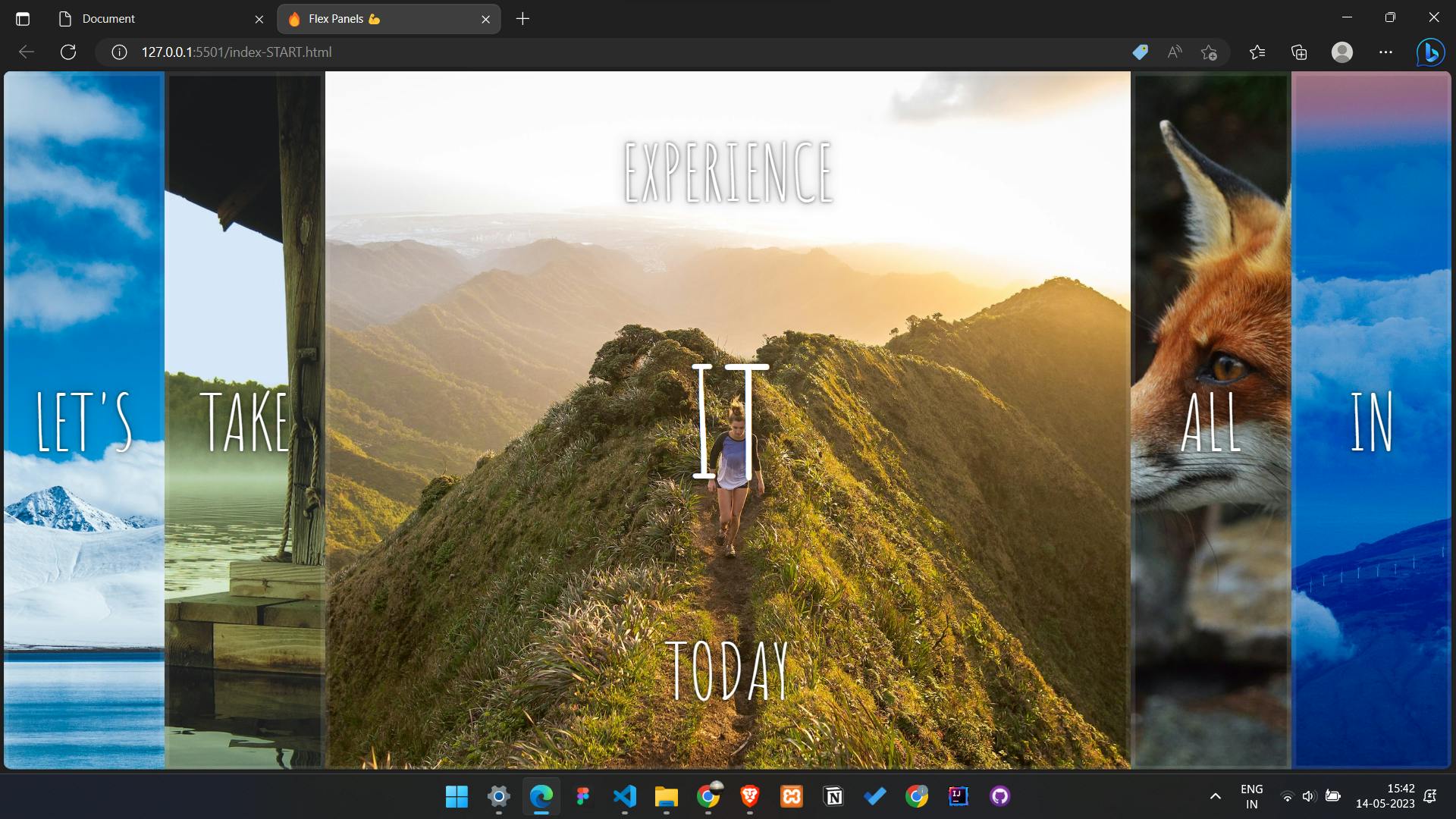
The project covered today in JavaScript30 is the Flex Panel Gallery, which involves building a gallery of images that expand when clicked. This project teaches developers how to work with CSS Flexbox and how to use JavaScript to manipulate the DOM and add event listeners.
The Flex Panel Gallery project involves creating a series of panels that contain images and text. When a panel is clicked, it expands to reveal more content and transitions smoothly using CSS animations. The project also includes features such as keyboard navigation, which allows users to navigate through the panels using their keyboard.
Key concepts used in the Flex Panel Gallery
Flexbox:
Flexbox is a CSS layout mode that allows you to create flexible and responsive layouts. In this project, we use Flexbox to create a grid of images that expands and contracts when clicked.
Transitions and animations:
Transitions and animations are used to create smooth and visually appealing effects when the user interacts with the images. For example, when an image is clicked, it expands and reveals more content, and when it is clicked again, it contracts and hides the additional content.
Event listeners:
Event listeners are used to detect when the user interacts with the images. In this project, we add event listeners to each image to detect when they are clicked and then it triggers the appropriate animations and transitions.
Template literals:
Template literals are a feature in JavaScript that allows you to embed expressions and variables inside strings. In this project, we use template literals to dynamically update the HTML content of the expanded images with the appropriate text and images.
CSS variables:
CSS variables are used to store and reuse values throughout a stylesheet. In this project, we use CSS variables to define common values, such as font sizes and colors, and to make it easier to update the styling of the gallery.
These are just a few of the key concepts used in the Flex Panel Gallery project, we will cover them one by one in a little more depth
Guide for building the "flex panel gallery" project
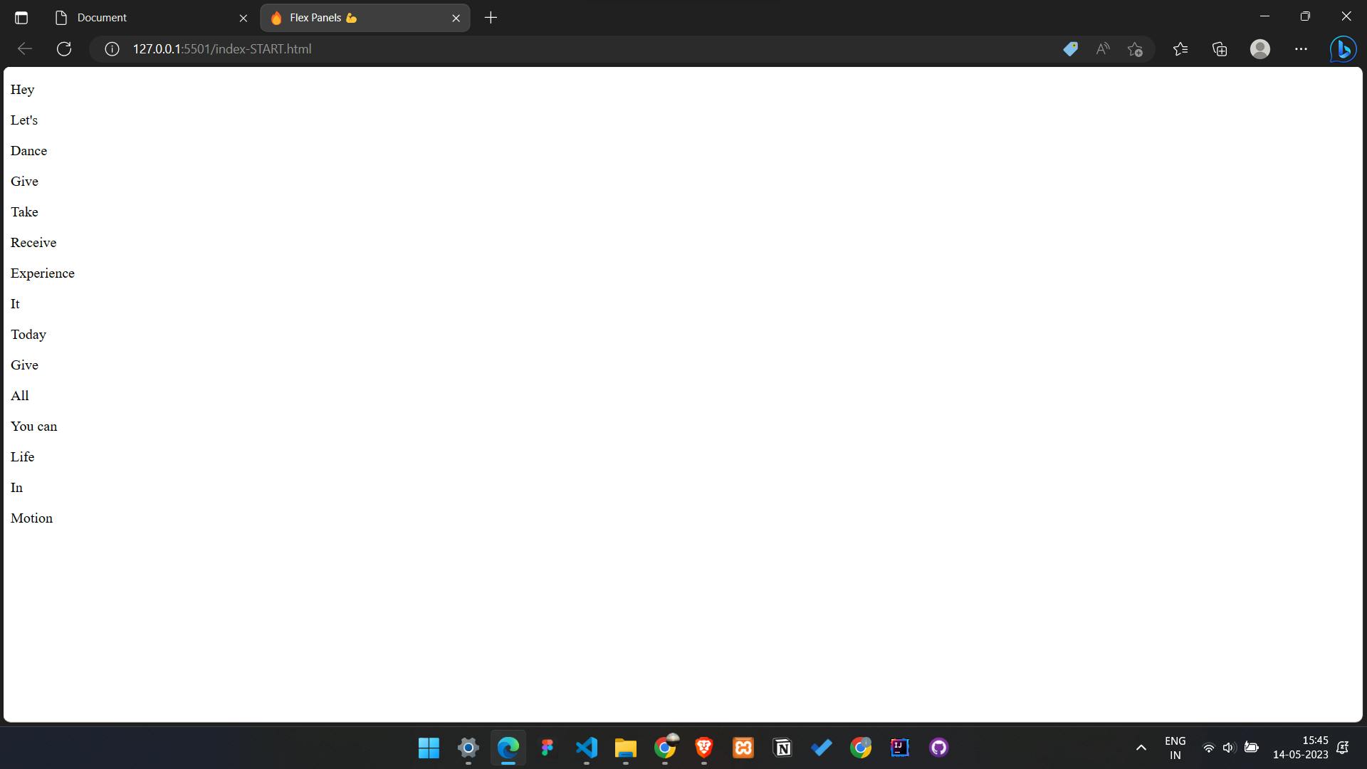
- First, create the HTML structure for the project. The gallery will consist of a series of panels that expand when clicked. Each panel will contain a heading and some text. Here's the basic HTML structure:
<div class="panels">
      <div class="panel panel1">
        <p>Hey</p>
        <p>Let's</p>
        <p>Dance</p>
      </div>
      <div class="panel panel2">
        <p>Give</p>
        <p>Take</p>
        <p>Receive</p>
      </div>
      <div class="panel panel3">
        <p>Experience</p>
        <p>It</p>
        <p>Today</p>
      </div>
      <div class="panel panel4">
        <p>Give</p>
        <p>All</p>
        <p>You can</p>
      </div>
      <div class="panel panel5">
        <p>Life</p>
        <p>In</p>
        <p>Motion</p>
      </div>
    </div>
- Next, add some CSS to create the layout and styling for the panels. We'll use Flexbox to make the panels expand and contract. Here's the basic CSS:
html {
        box-sizing: border-box;
        background: #ffc600;
        font-family: "helvetica neue";
        font-size: 20px;
        font-weight: 200;
      }

      body {
        margin: 0;
      }

      *,
      *:before,
      *:after {
        box-sizing: inherit;
      }

      .panels {
        min-height: 100vh;
        overflow: hidden;
        display: flex;
      }

      .panel {
        background: #6b0f9c;
        box-shadow: inset 0 0 0 5px rgba(255, 255, 255, 0.1);
        color: white;
        text-align: center;
        align-items: center;
        /* Safari transitionend event.propertyName === flex */
        /* Chrome + FF transitionend event.propertyName === flex-grow */
        transition: font-size 0.7s cubic-bezier(0.61, -0.19, 0.7, -0.11),
          flex 0.7s cubic-bezier(0.61, -0.19, 0.7, -0.11), background 0.2s;
        font-size: 20px;
        background-size: cover;
        background-position: center;
        flex: 1;
        display: flex;
        justify-content: center;
        flex-direction: column;
      }

      .panel1 {
        background-image: url(https://source.unsplash.com/gYl-UtwNg_I/1500x1500);
      }
      .panel2 {
        background-image: url(https://source.unsplash.com/rFKUFzjPYiQ/1500x1500);
      }
      .panel3 {
        background-image: url(https://images.unsplash.com/photo-1465188162913-8fb5709d6d57?ixlib=rb-0.3.5&q=80&fm=jpg&crop=faces&cs=tinysrgb&w=1500&h=1500&fit=crop&s=967e8a713a4e395260793fc8c802901d);
      }
      .panel4 {
        background-image: url(https://source.unsplash.com/ITjiVXcwVng/1500x1500);
      }
      .panel5 {
        background-image: url(https://source.unsplash.com/3MNzGlQM7qs/1500x1500);
      }

      /* Flex Children */
      .panel > * {
        margin: 0;
        width: 100%;
        transition: transform 0.5s;
        /* border: 1px solid red; */
        display: flex;
        flex: 1 0 auto;
        justify-content: center;
        align-items: center;
      }

      .panel > *:first-child {
        transform: translateY(-100%);
      }
      .panel.open-active > *:first-child {
        transform: translateY(0);
      }
      .panel > *:last-child {
        transform: translateY(100%);
      }
      .panel.open-active > *:last-child {
        transform: translateY(0);
      }
      .panel p {
        text-transform: uppercase;
        font-family: "Amatic SC", cursive;
        text-shadow: 0 0 4px rgba(0, 0, 0, 0.72), 0 0 14px rgba(0, 0, 0, 0.45);
        font-size: 2em;
      }

      .panel p:nth-child(2) {
        font-size: 4em;
      }

      .panel.open {
        flex: 5;
        font-size: 40px;
      }

- Now we need to write the JavaScript that will make the panels expand and contract when clicked. We'll use event listeners to listen for clicks on each panel, and toggle a CSS class to open and close them. Here's the basic JavaScript:
const panels = document.querySelectorAll('.panel');

function toggleOpen() {
  this.classList.toggle('open');
}

function toggleActive(e) {
  if (e.propertyName.includes('flex')) {
    this.classList.toggle('open-active');
  }
}

panels.forEach(panel => panel.addEventListener('click', toggleOpen));
panels.forEach(panel => panel.addEventListener('transitionend', toggleActive));
That's it! With these HTML, CSS, and JavaScript snippets, you should be able to build the "flex panel gallery" project. Good luck!
Other Reads
This blog provides a brief overview of the topics covered in the JavaScript30 course. For those looking for a quick review or to brush up on their JavaScript skills, this blog is a great resource. However, for a more comprehensive understanding of the topics covered, I highly recommend checking out the JavaScript30 course.
The JavaScript30 course covers a wide range of practical JavaScript projects that will help you build your skills and understanding of the language. The course is designed for anyone with a basic understanding of JavaScript and covers topics such as working with the DOM, manipulating CSS with JavaScript, making AJAX requests, and using ES6 features.
Overall, the JavaScript30 course is an excellent resource for anyone looking to improve their JavaScript skills and build practical projects. By following along with the course, you'll gain a solid understanding of the language and be able to apply your skills to real-world projects.
Reference
Other javascript30 Blogs to follow along
Learn Flex-box
Unsplash for free stock images